Shangri-La’s Tattoo Emporium is a high-end, fully custom tattoo studio located in Newburgh, Indiana. The goal of the project was to position the studio as the trusted authority in tattooing for Newburgh and the surrounding Tri-State area. Each aspect of the rebrand was executed in order to help the studio attract clients that preferred quality, custom artwork over stereotypical flash work.
Naming Brand Identity Brand Strategy Creative Direction Website Design
The Problem
Robbie Hernandez opened his studio in 2012 with the purpose of creating an environment that was the antithesis of the standard tattoo shop(s). Over time, he built a reputation of providing quality work in a peaceful setting. However, after nearly eight years, the studio was beginning to feel that it’s message as a custom tattoo shop was getting lost. In order to continue in the direction of Robbie’s original vision–especially as he began training and adding handpicked artists to his team–an overhaul in the brand was needed.
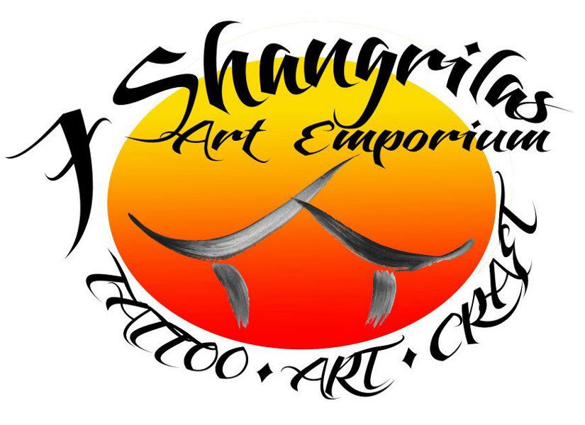
Original Logo
The solution
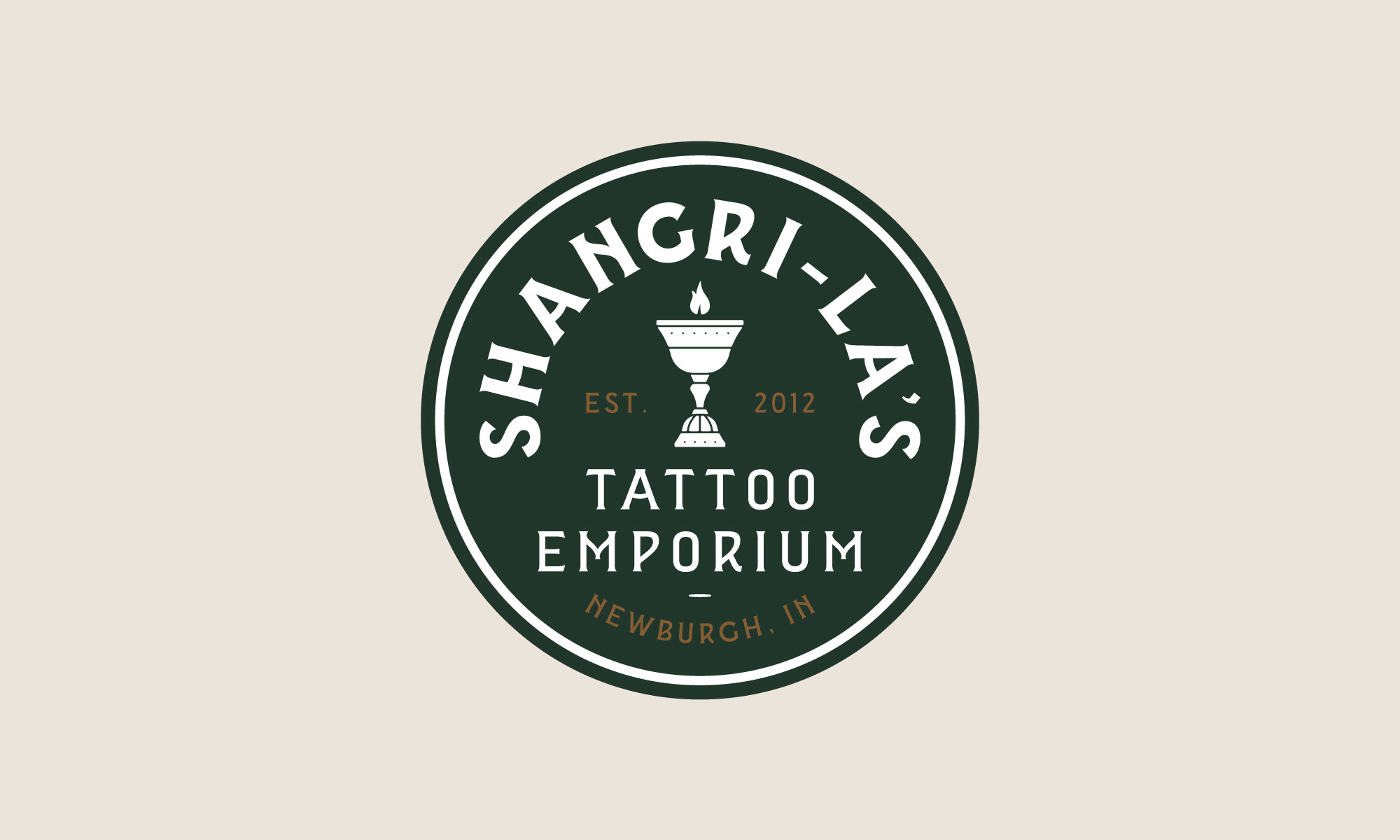
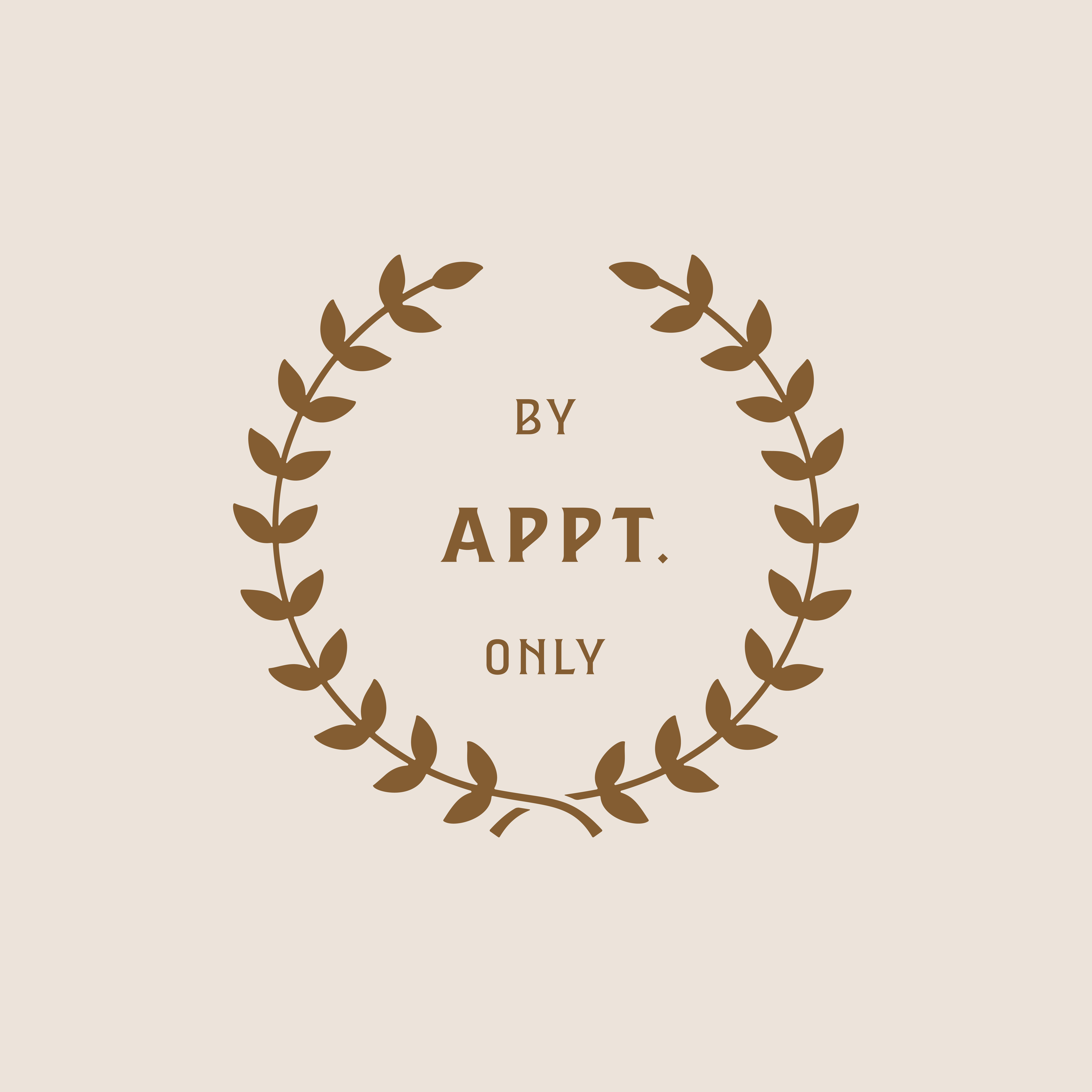
A brand evaluation was completed with the studio. It was during this task that the problems, goals, and desires were outlined to help navigate the direction of the rebranding process. It became clear that the original name (7 Shangri-Las Art Emporium) made it difficult to attract the target clientele and that the current identity was hard to read, potentially adding to the problem.
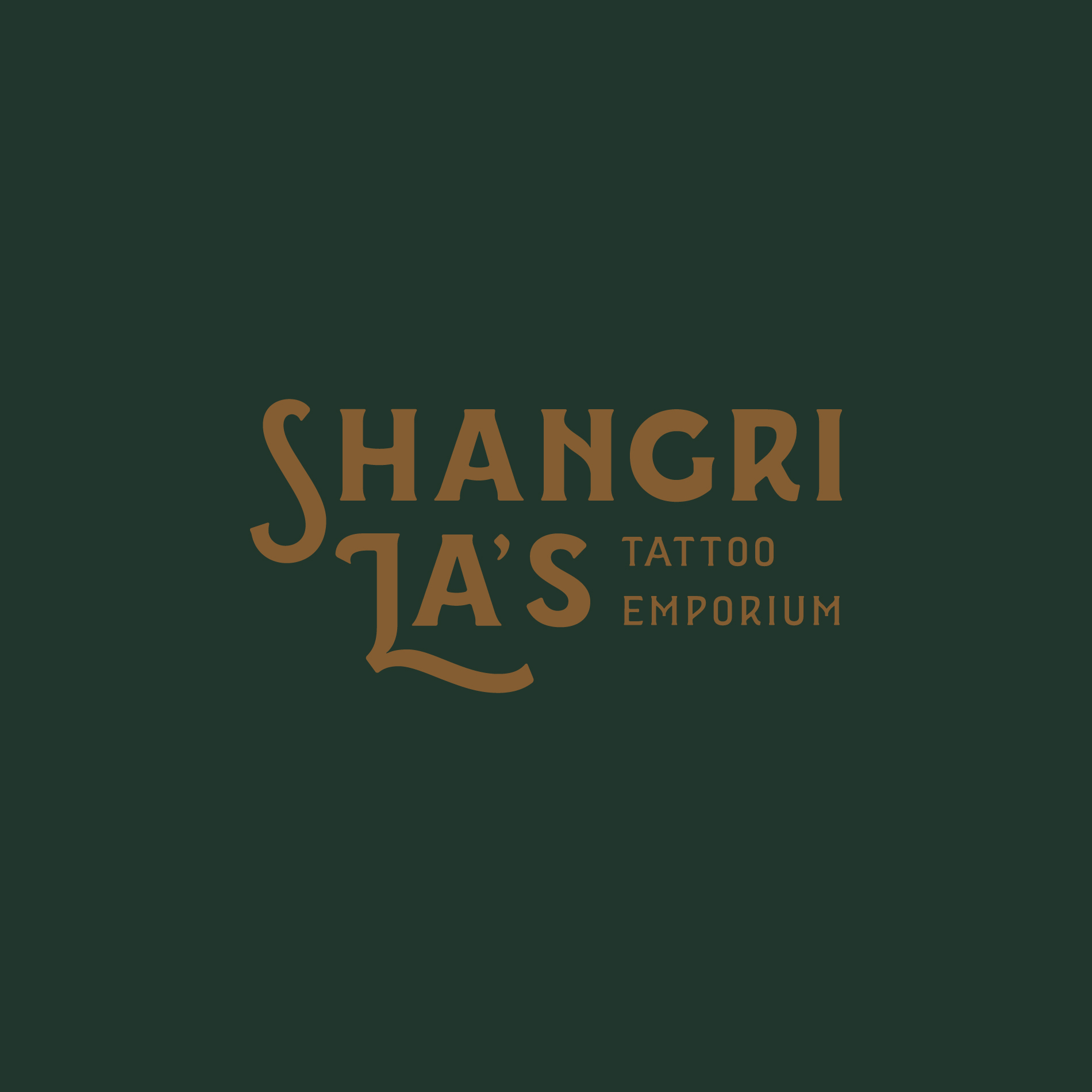
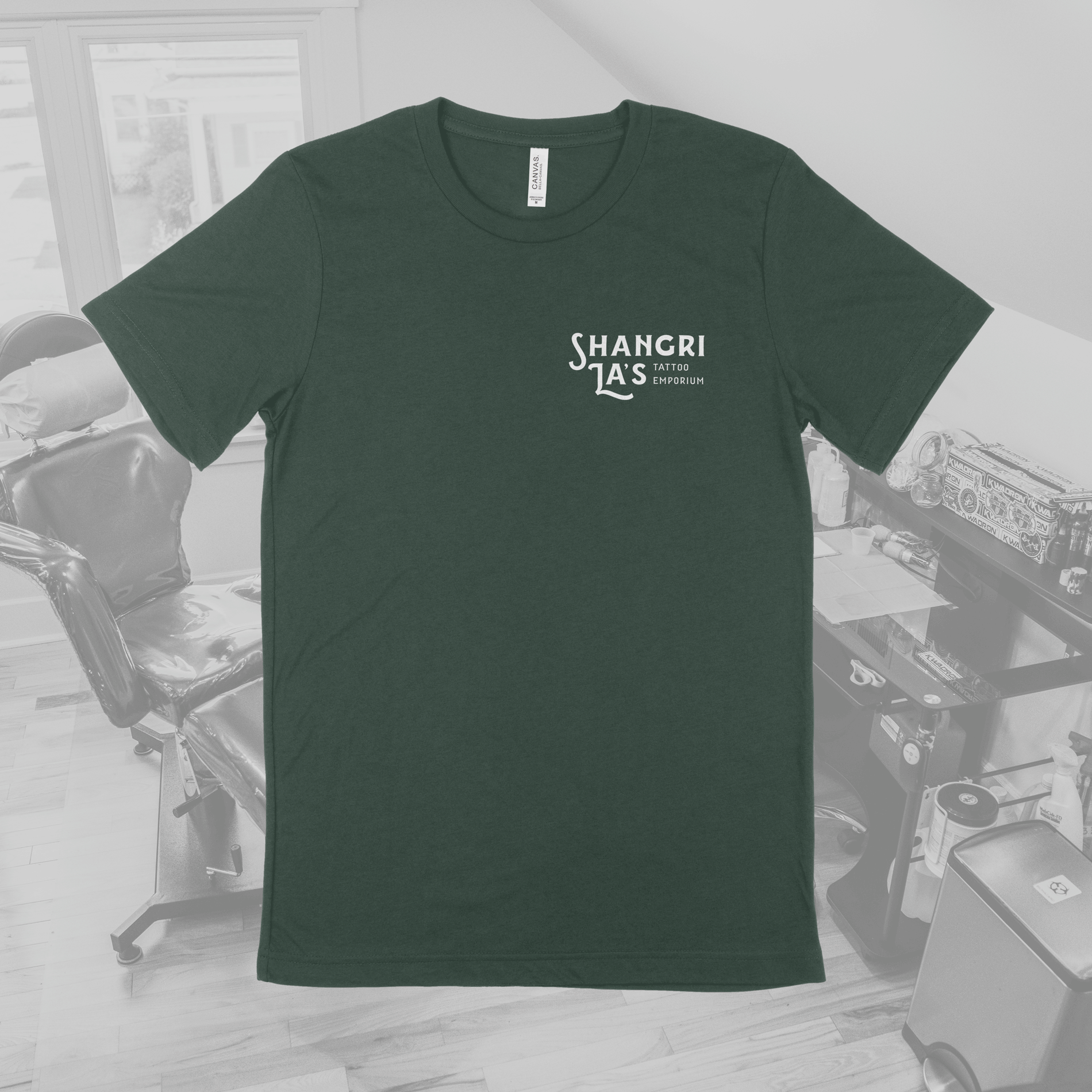
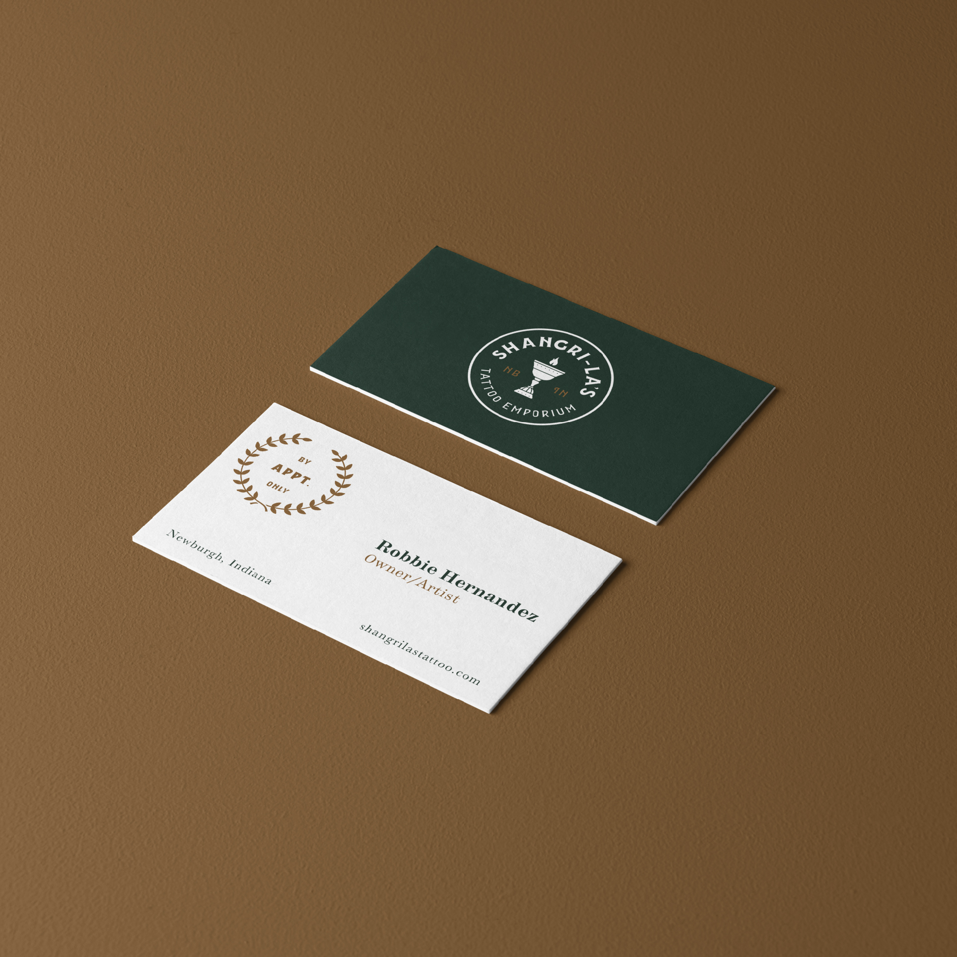
A brand new name altogether was initially discussed, but it was decided to change the name to Shangri-La’s Tattoo Emporium. This allowed them to maintain brand recognition while also clarifying their message. A new identity system was then designed to support that message. It is inspired by the life of Tibetan monks and represents the tranquility found at the quiet and quaint tattoo studio located on the riverfront of Newburgh, Indiana.
The Larger Picture
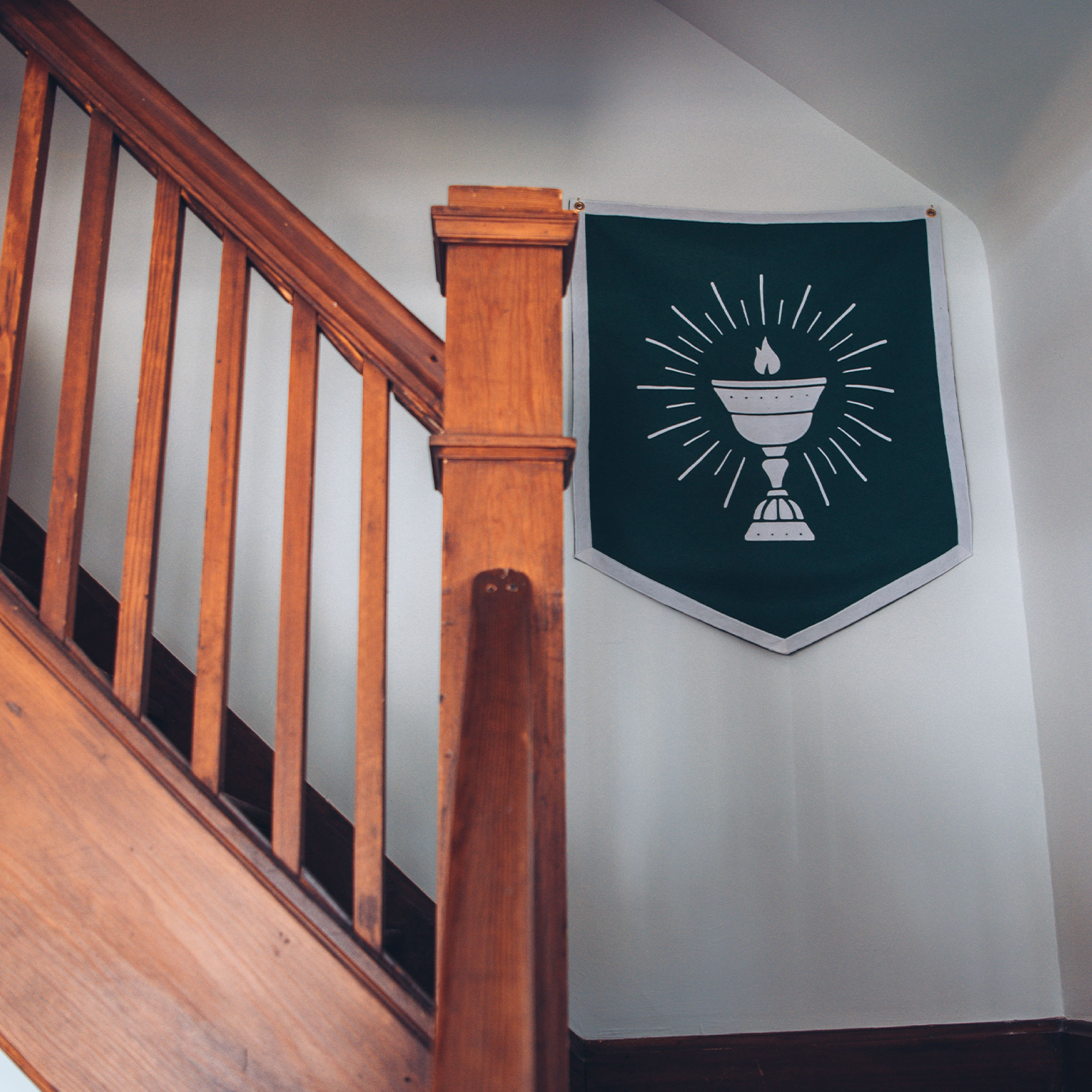
After the identity was developed, it was then applied to other support elements for the studio. The most exciting piece was a custom flag that was pitched during the identity reveal meeting. It was hand-sewn by Oxford Pennant in Buffalo, NY and is influenced by the Tibetan Prayer Flags commonly seen in the Himalayas.
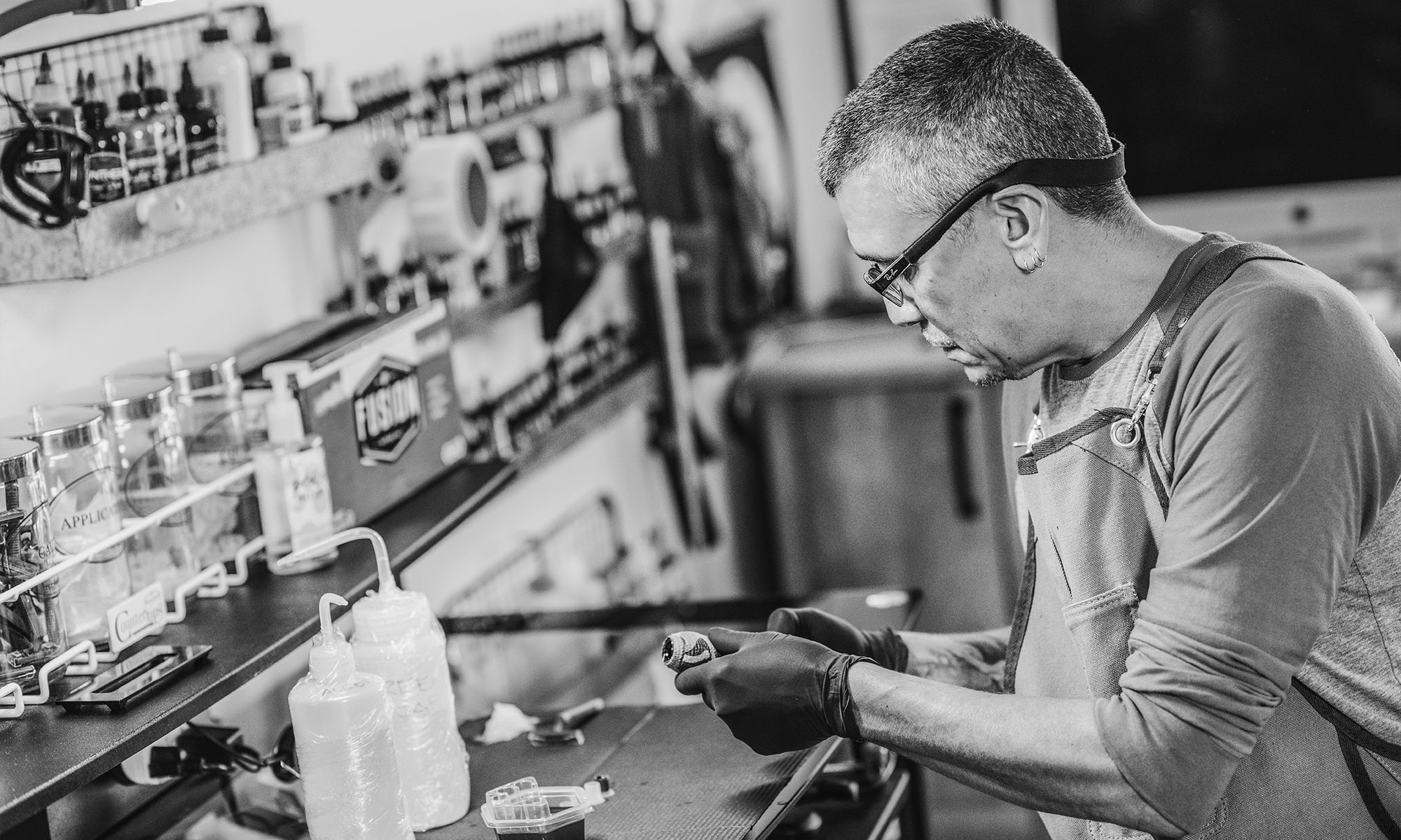
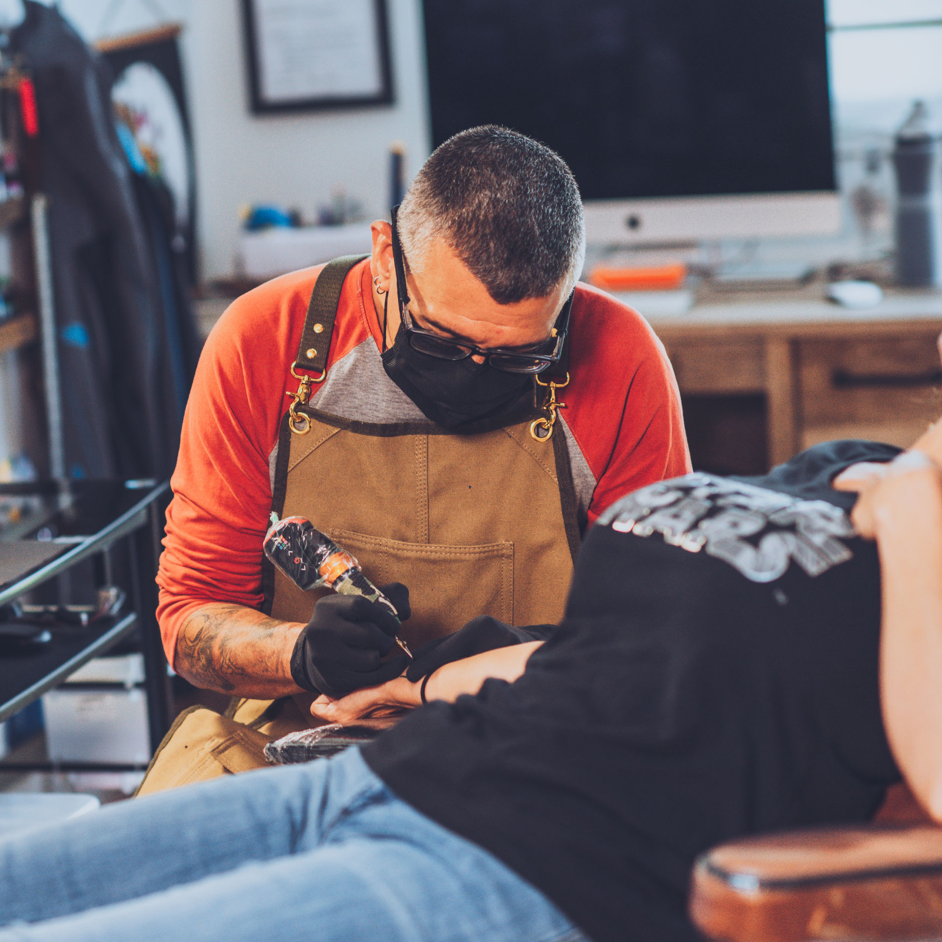
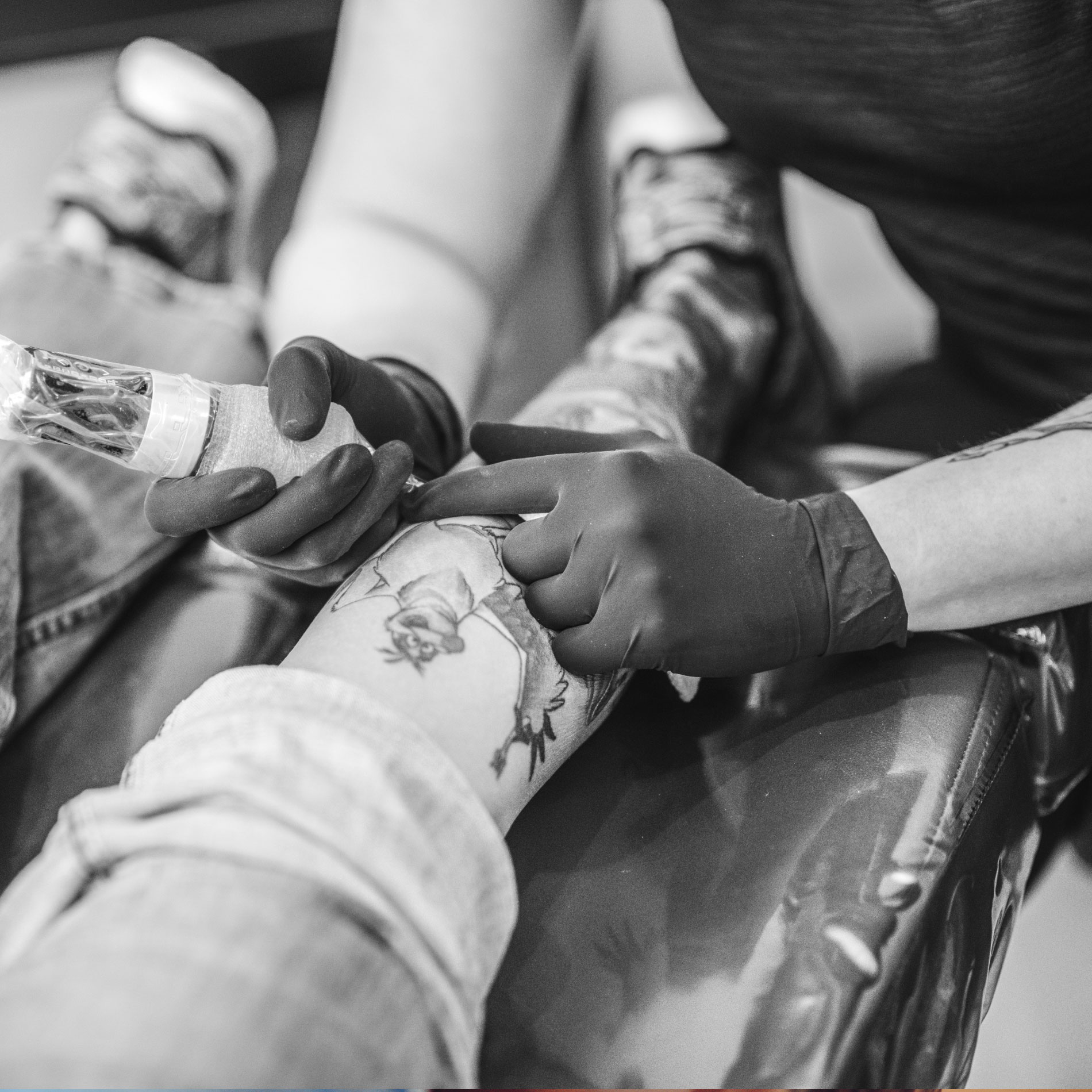
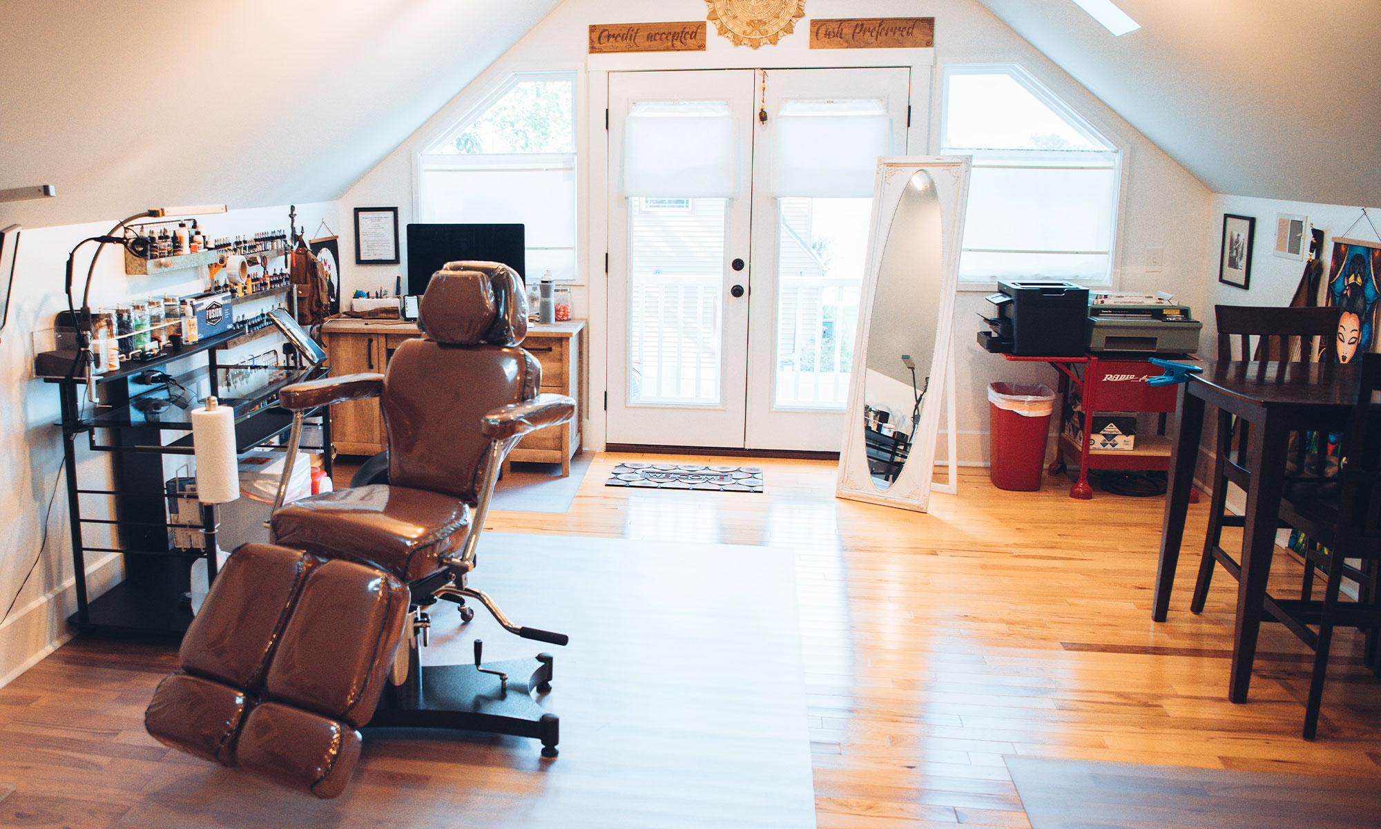
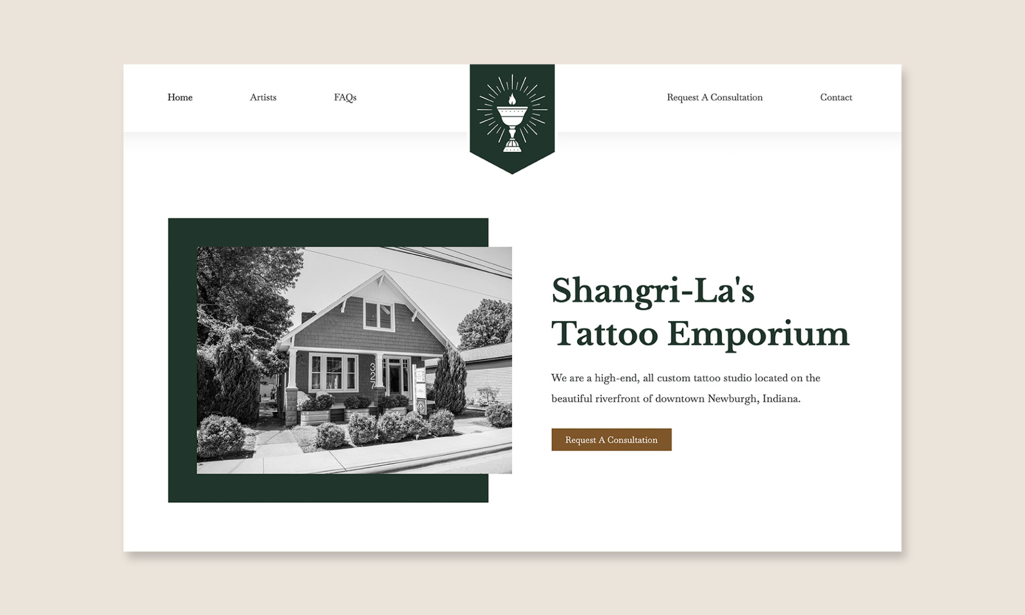
The final pieces of the project were photography (provided by Alex Morgan Imaging) and a brand new website; both of which were executed in a manner that connected with the branding and portrayed aesthetics of light, cleanliness, and professionalism.
“We gave Joe complete creative control and when the project was done, I was completely amazed. It was beautiful and seamless down to the last detail. The imagery he created was beautifully striking, professional, personal and truly represented who we were. Our site was equally so. It was easy to navigate for clients and functional for us. Now that we’re expanding our market, I realize the importance of the decision we made to rebrand. We now have a cutting edge brand, an identity and a history wherever we go. The single best investment I’ve ever made for my business.”